How one page checkout will increase conversion rate and reduce shopping cart abandonment by adding few important features.
We live in a world when e-commerce is growing very fast every day. Buying products online should be easy and simple with only two or three clicks. According to Baymard Institute 67.45% of online shopping carts are abandoned and that 37% of shoppers do not complete their purchase when they are required to create an account.
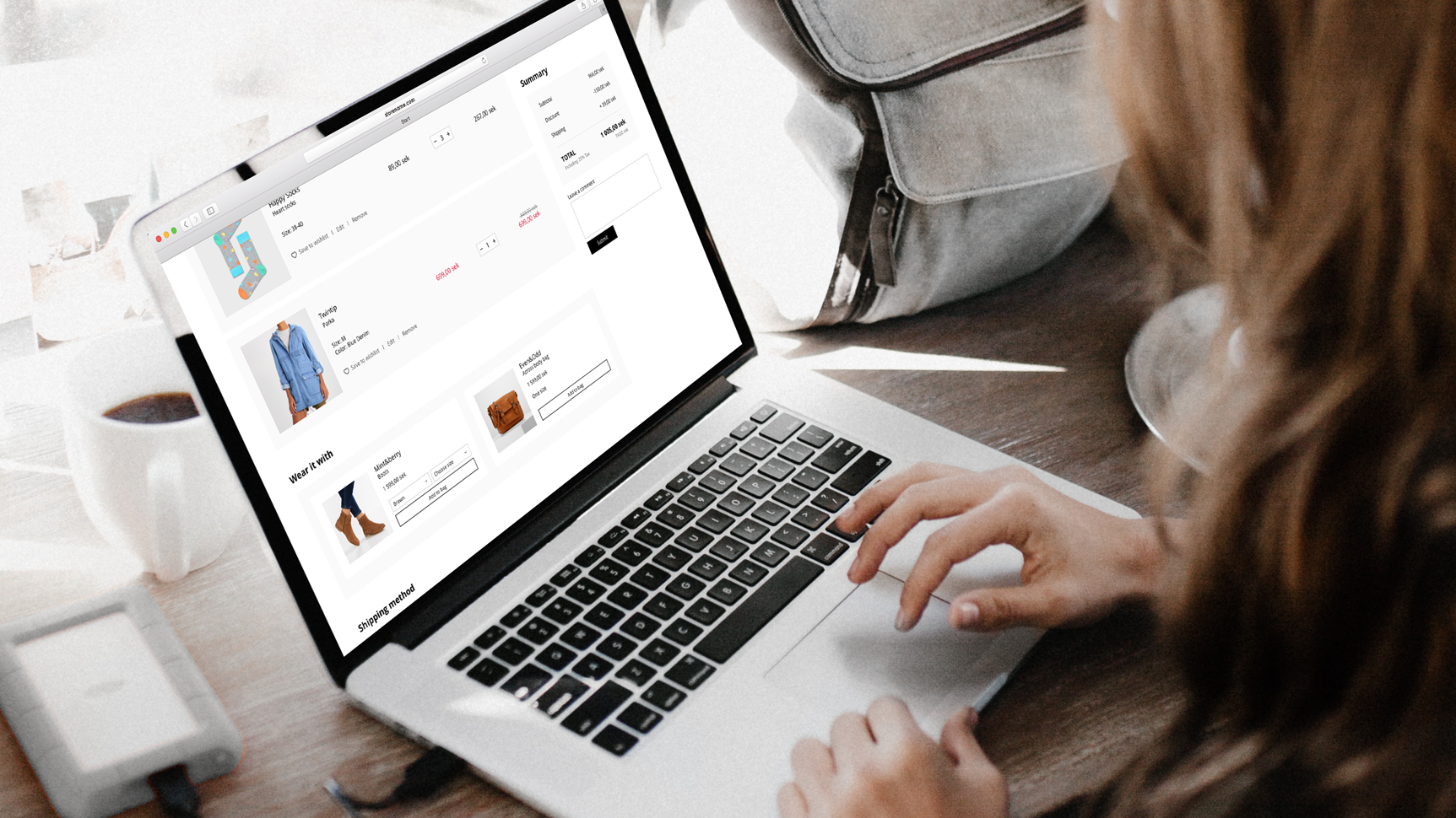
One page checkout is simple and provides all information upfront for customers (shipping and payment methods), unlike multi-step checkout — where purchasing a product takes longer time. Having one page checkout will increase conversion rate and reduce shopping cart abandonment.
Scandinavian design in general is known for being minimalistic, clean with simple lines, but always focusing on user interaction and user experience. Here are some important features to include in your checkout and an idea how to organize them to look good in all screens.
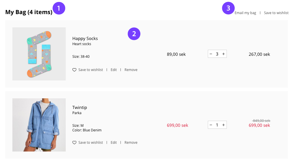
1. Items
It’s very easy to lose track of how many items customer has put into cart, especially if the he buys small products.
It’s very easy to lose track of how many items customer has put into cart, especially if the he buys small products.
2. Product reviews
Our brain process visual information 60,000 times faster than text. Having big product images will help customers recognise the added items. Product information such as: product name and selected attributes (size and colour), price per unite and total price, quantity of individual products, possibility to change the attributes and remove a product are very important for customers decision.
Our brain process visual information 60,000 times faster than text. Having big product images will help customers recognise the added items. Product information such as: product name and selected attributes (size and colour), price per unite and total price, quantity of individual products, possibility to change the attributes and remove a product are very important for customers decision.
3. Email my bag and save my bag to wishlish
- Customers can email their shopping bag to friends or family and have a discussion about their favourite products.
- Some people shop one day and return after few days later to finish their purchase. The same Business Insider (2014) says that three-fourths of shoppers who abandon a shopping cart equally plan on returning to purchase later. ‘Save my bag’ feature will help customers save their added products.
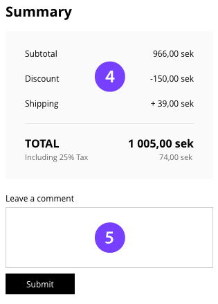
4. Summary
Shoppers are making final purchase decisions in the cart, so don’t hide costs and include as much information as you can in this part:
Shoppers are making final purchase decisions in the cart, so don’t hide costs and include as much information as you can in this part:
- subtotal
- how much money are saved by buying products on discount
- shipping cost
- taxes
- total price
- how much money are saved by buying products on discount
- shipping cost
- taxes
- total price
5. Leave a comment
This will allow customers to describe how to prepare and deliver their order - for instance if a customer has special hours for delivery or if he wants a product to be wrapped.
Tip: Since the final price depends on the chosen shipping method, on mobile this box should end up between shipping and payment method.
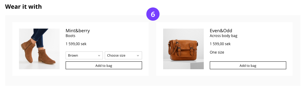
6. Attract customer to buy more
This will remind the customer about other products he may be interested in, based on the current added products. Customer can buy more products even without leaving the cart.
8. Shipping and payment method
Provide at least one low-cost shipping option. If you own a physical store, include ‘pick up in store’ as an option.
Definitely, you don’t want to loose your customers because of the payment method. The number of payment methods is growing, so provide various payment options.
Provide at least one low-cost shipping option. If you own a physical store, include ‘pick up in store’ as an option.
Definitely, you don’t want to loose your customers because of the payment method. The number of payment methods is growing, so provide various payment options.
Tip: Payment options that support registration and profiles make it easy for the users to pay with a single click. For example, in Sweden, it is common to have a payment option by Klarna, next to the ‘card’ and ‘direct bank payment’ methods. It is always a good idea to include this kind of payment services, so more users will be matched. Also, some users are hesitant to leave personal information on a website, so using these kind of services will help them too.
Read the full story on Medium