Adisgladis is a Stockholm-based physical and online store for ethical and sustainable products.
Customers can explore and purchase clothes, shoes, accessories and products for camping. They sell products from different fair trade and ethical fashion brands, such as Armedangels, Veja, Kings of Indigo, Knowledge Cotton Apparel and many many more.
I designed a responsive e-commerce site that meets user’s needs and goals while focusing on the client’s business goals.
My goal
Make the digital shopping experience easier and similar to in-store shopping, by giving the users ability to view up close and zoomed in details of products, clean navigation, call to action button and a smooth checkout process.
Process
I did a competitive analysis, I created a persona to guide my design process and user stories and then, I gathered all pain points and ideas and did my best to provide the best solutions for users. I created a prototype for designed screens in InVisionApp.
Competitive Analysis
I did a competitive analysis of other fashion store sites, that have products from similar brands. Key findings identified were:
- Talk about fabrics a lot,
- Clean and hi-res inspiration images everywhere,
- Hard to find if they have a physical store,
- Social media.
Empathize
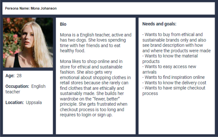
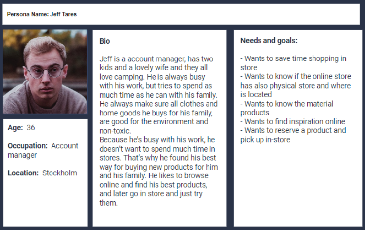
To better empathize with users, I created 2 provisional personas, based on assumptions and online research. Focusing on a specific user helps to keep its needs and goals.
User stories
In order to understand better the users and why someone would purchase from Adisgladis, I created a list of possible users and situations.
Information architecture & User Flowchart
Before I start sketching, I created information architecture and user flowchart. It’s easier for me to sketch my ideas when I already know how the information is organized and how the website should work.
Ideation
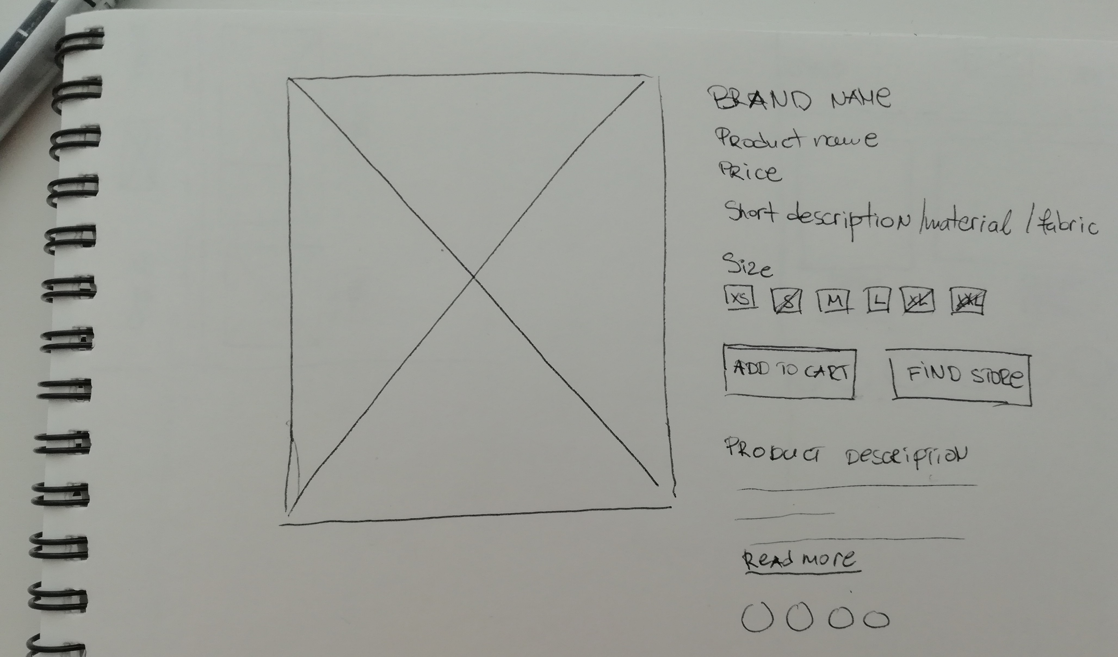
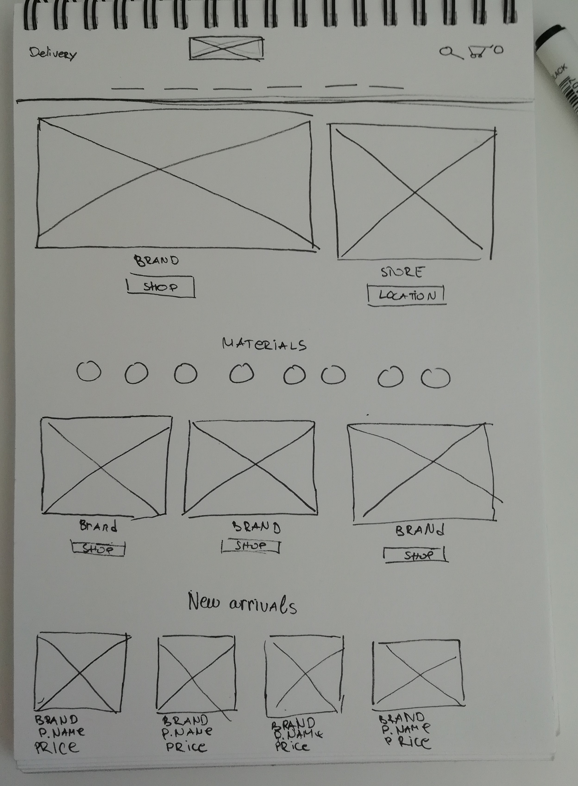
Now that I identified all goals and needs for our users, I come up with couple of ideas and sketched on paper.
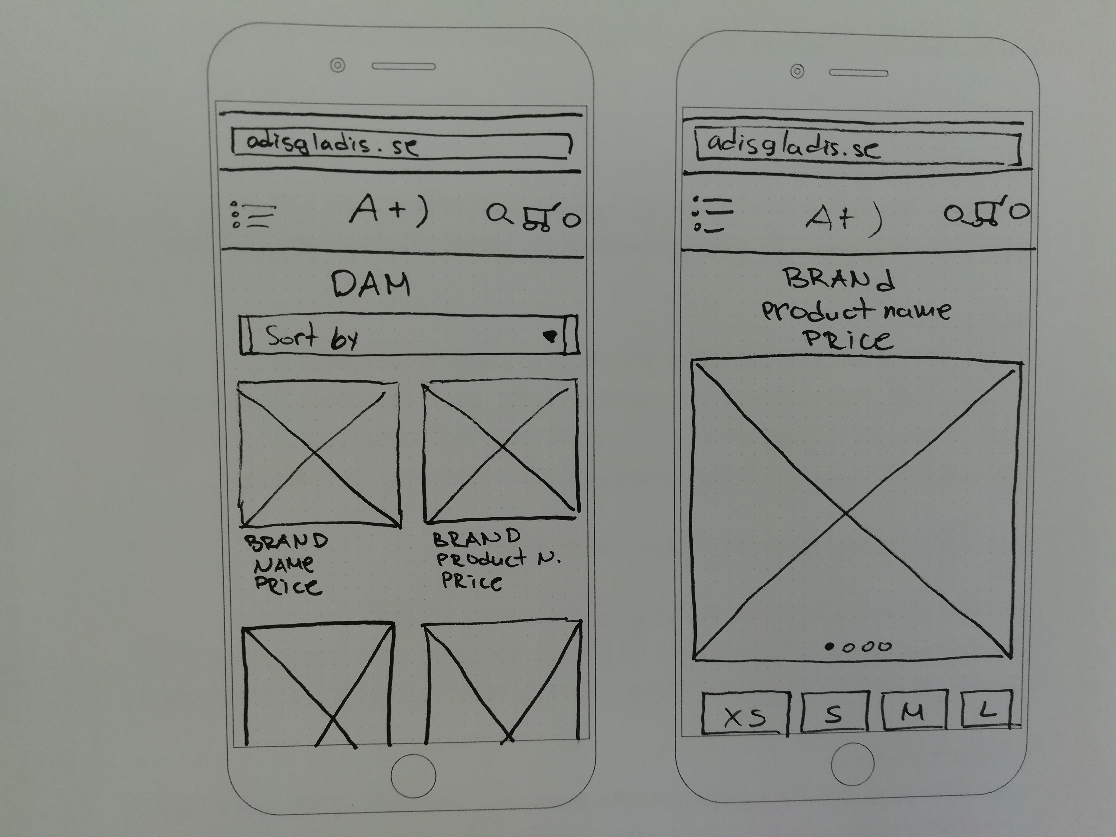
Prototyping
After sketching on paper I turned my ideas into high fidelity screens and explored different design possibilities. I created a prototype in InVision App.
You can see the prototype on this link
https://invis.io/JEN3X9VN94K
Together with my team we tested and present the ideas to the client.
Color Palette & Typography
The client already had its own branding color, designs for the beautiful material icons and the typography, so I thought they are nice and kept them.
Final visual design
After testing and the feedback from the client here is the final design.
- Clean and well organized navigation,
- Image from store and link to store location for those users who want to purchase in store or reserve a product online and pick up in a store,
- Call to action buttons,
- Exposed brands,
- New arrival products,
- Cute material icons are part of this page as well.
Navigation with three levels
- Category list with big product images with yellow borders,
- Second product image can be seen on hover together with short material description.
- Product page with big product images and good zoom option,
- Brand name is presented above product name and price,
- Product sizes - in stock and out of stock,
- Add to cart and see store location buttons,
- User can continue browsing products from where they stopped before entering the product details, right after the product ends.
Hover effects for product page
Mini shopping cart
When it comes to shopping cart and checkout, I designed one page checkout, for easier, faster and simple purchasing process.
All necessary information like preview product image, price, amount, subtotal and total price, delivery and payment options are well organized, and it doesn't require login or sign up. According to Baymard Institute 67.45% of online shopping carts are abandoned and that 37% of shoppers do not complete their purchase when they are required to create an account.
My opinion on why and how can one page checkout increase your conversion rate, can be found on this link
Contact & Store opening hours
Mobile screens
What I could have done better
If I had more time and resources, I would have done qualitative research that includes interviewing users and get more data and analyse their frustrations and goals. To understand users behavior, I would have done usability testing as well.