A few months ago I applied in H&M for a UI designer role and as part of their recruitment process I received home assignment for solving a very interesting problem (yey I love solving problems). The assignment was called Shop the Style feature and as they said the current layout, i quote: “is not optimal from a user and business perspective”.
The goal of Shop the style is to help users discover and buy multiple products from their favourite outfit without leaving the page.
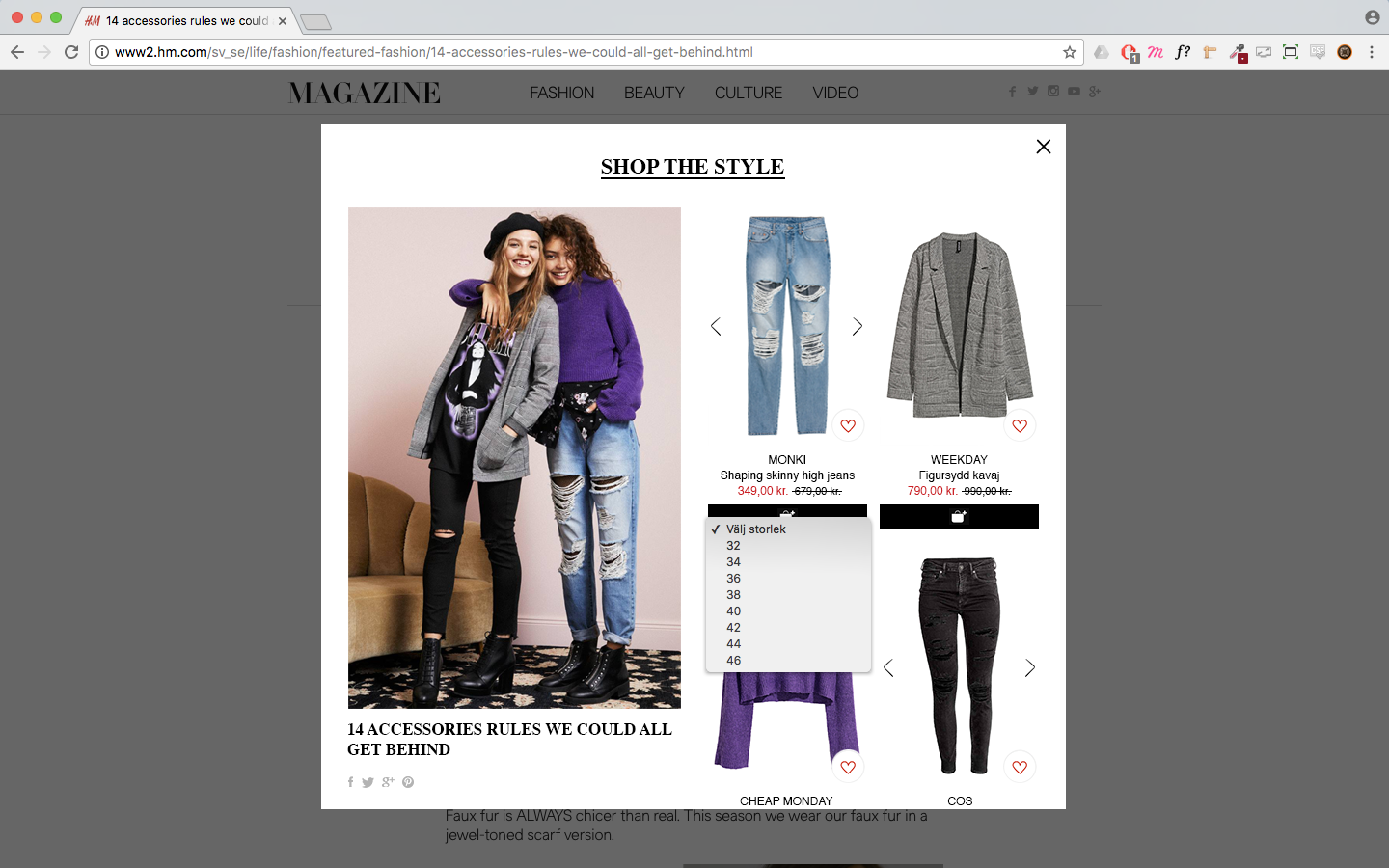
This is their existing layout for 'Shop the style'
Defining the problem from the existing layout
- Doesn’t work for screen sizes other than a wide screen
- Difficult to see if a product has more variants (color, size)
- Missing call to action buttons such as: select size and add to bag
- Doesn’t work if the styling image is in a different format — landscape or square format and limited to present only 8 products
- On mobile - when user scrolls to products below the fold, the styling image is out of the screen and the user can’t really refer the product to the styling
Goal
- Expose relevant products for specific style as much as possible
- User should be able to buy complete outfit directly, without living the page
- Buying process needs to be minimized (limited) to two clicks
My proposal
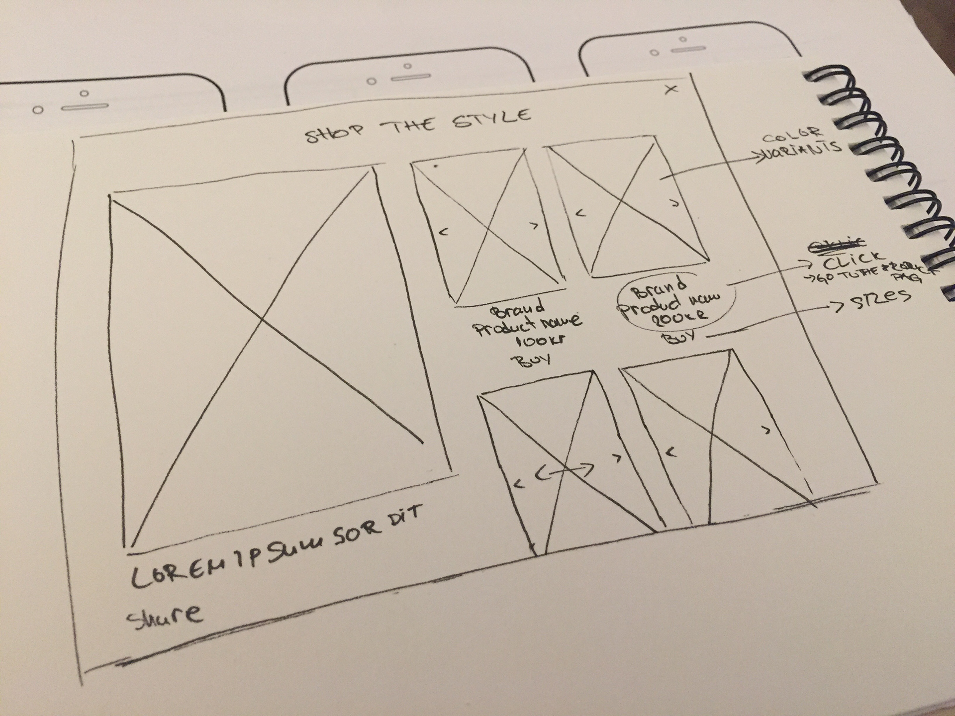
The tricky question with this task was: how to make a layout that sometimes can have 2 exposed products and sometimes 15 and each product can have up to 30 sizes.
When you design for online store, you should be aware that nothing is fixed and that your design needs to be very flexible and adapt for all kinds of product variation and description.
After a quick research and going back and forth with ideas I finally came up with a good solution. Here is a part of my sketches for different ideas.
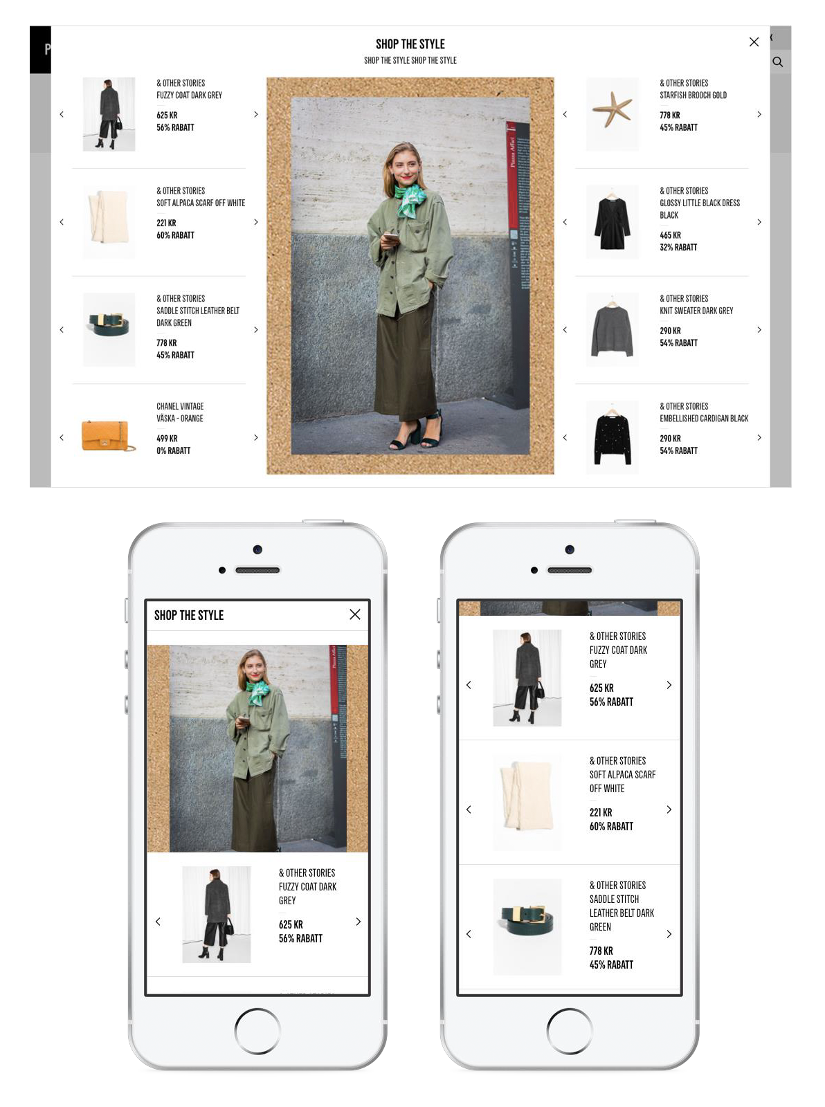
Solution for desktop
In general I hate pop-ups, but this time I decided to keep from the existing H&M’s layout. That will enable the users to stay on same page and don’t need to deal with slow loading animations.
- Pop-up that is divided to two equal parts: left-side with styling image that stays fixed and right-side which is scrollable with products
- User can choose from different colors of a product by clicking the arrows for left and right
- H&M already has a feature for when users want to add the chosen product and they click on the buy button - dropdown with sizes will open
- When the variant is selected the product will be added to the cart
- To go to a product page and see a product description and details, user must click on the product name or price
- Added the ability to share the chosen style on social media
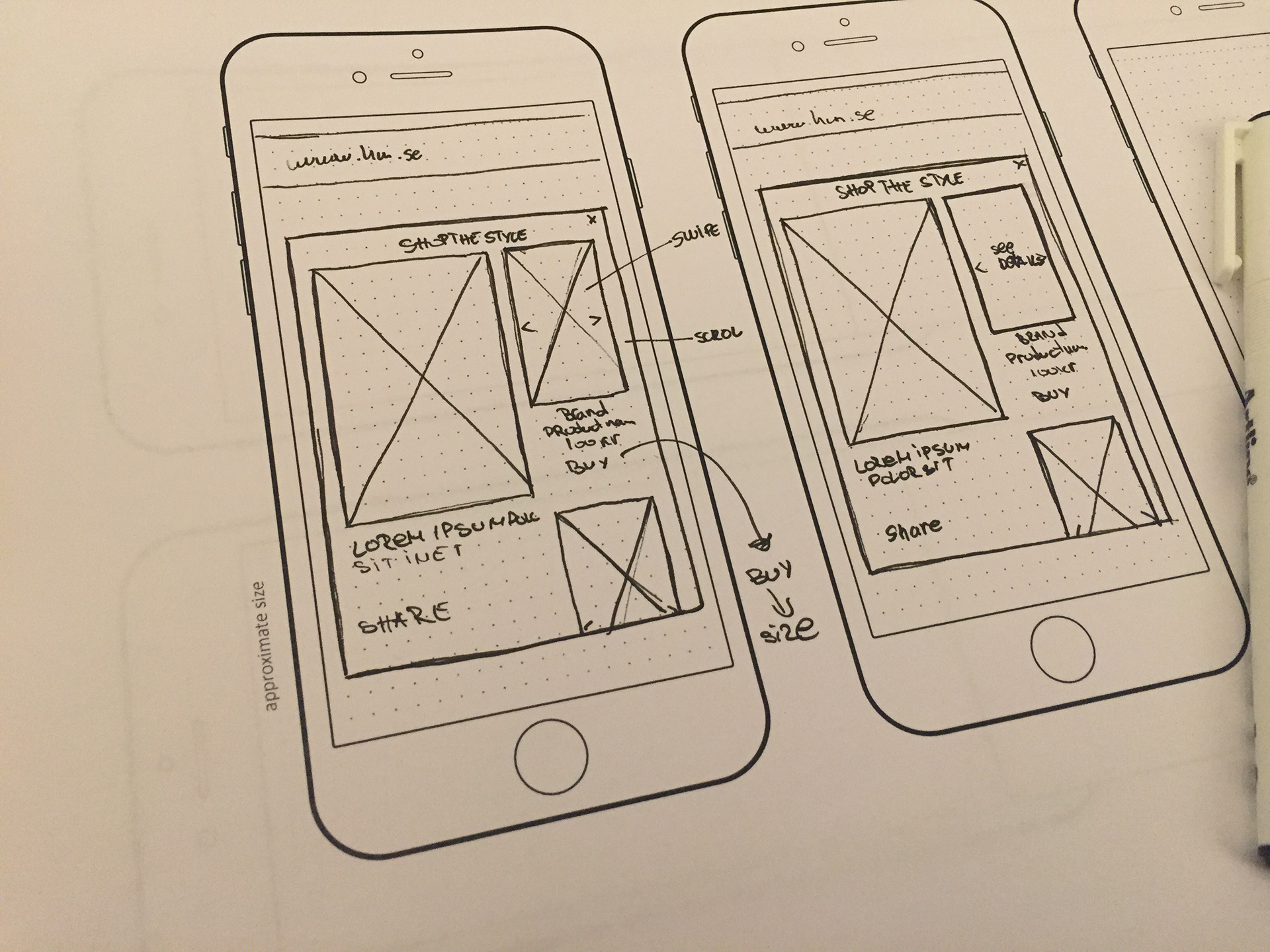
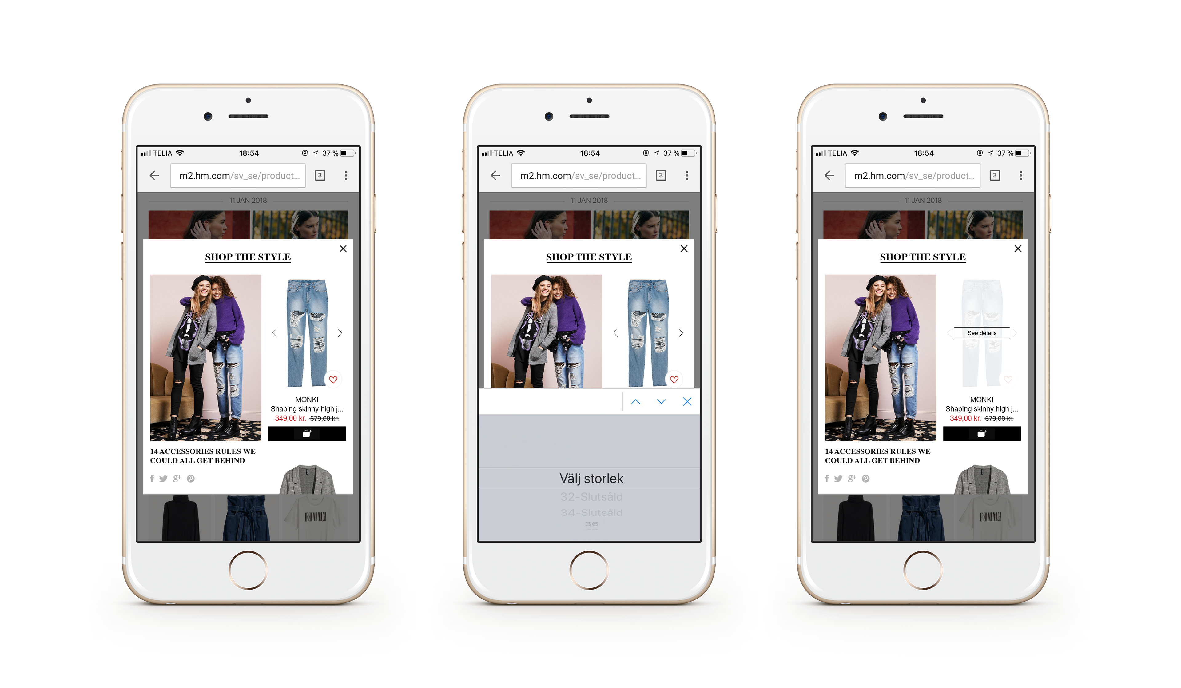
Solution for mobile
- Fixed left-side is 60% of the pop-up and right-hand side is scrollable
- Swipe left and right to see more colors of a product
- When user wants to add the chosen product to the cart by clicking the buy button, native dropdown list will appear
- To go to a product page and see a product description and details, user must tap on the product picture and click on ‘see details’ button