The brief
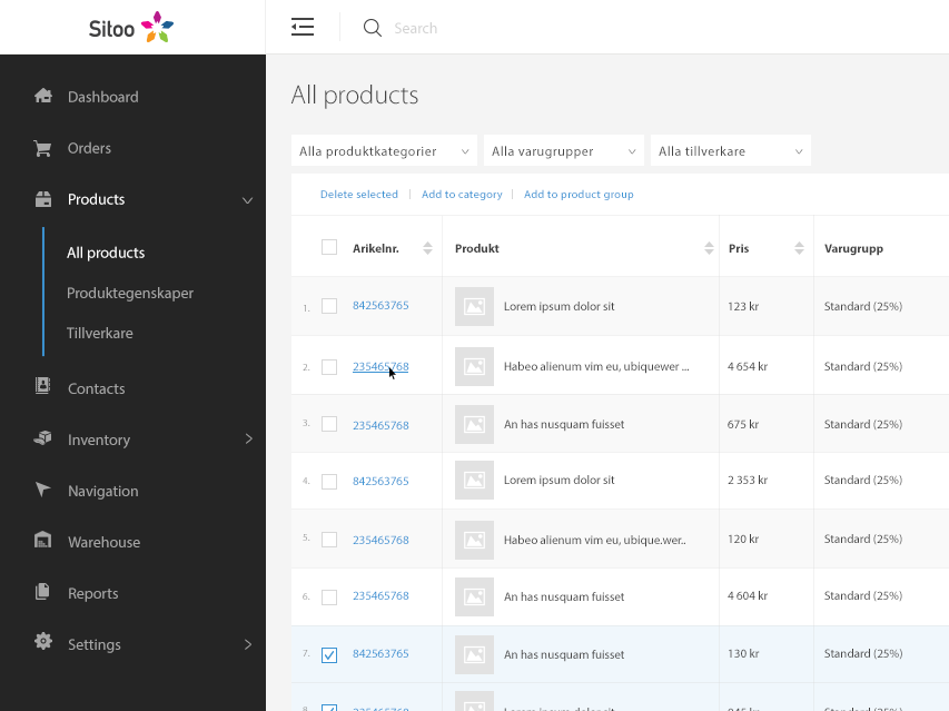
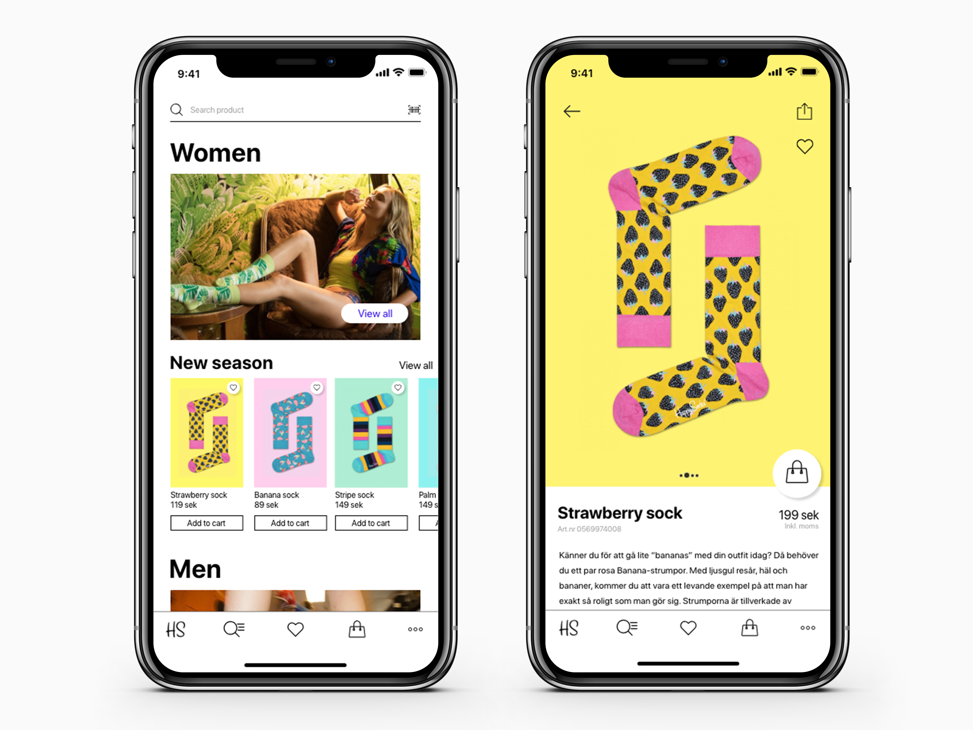
Sitoo is a product company that has a Point of Sale for retails and an e-commerce platform. All products from a physical or online store will be stored in the admin panel or so-called Back Office.
Project
Today users want to have quick information, whether they get the needed information from an agent over the phone or use web or mobile self-service. The main key for having a successful product company is to have strong and productive customer relationship.
Research
In this company there are four people that take calls. Since it’s a small project I didn’t do any customer interviews or surveys. But instead I got all the needed answers from the support team at this company. The reason I did that, is because they talk with customers all day, they know all the questions that they often ask and why they prefer the support line instead of finding their answer for their problem on the website.
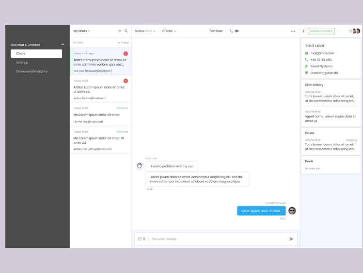
Old support concept for Sitoo
Define the Problem
- Define customers
Customers aging 20–70 years old;
- Too many categories
The current information architecture is confusing and frustrating. Customers spend a lot of time trying to find in which category their problem is placed;
- Call support line
Customers often call the support line because they can’t find the needed information in the site in a short period of time, so for them is faster to call an agent and get the answer for their problem;
- Missing FAQ
- Cold welcome
Having a dark background in a customer support site gives negative feeling;
- Boring colors and lines
Icons and typography are very small and unclear.
My goal is to
- Show that the support team really cares about the customers;
- Improve the search flow and decrease the daily calls to the support line by making it easier and faster to find the needed information;
- Make the number one place to go when a customer need information or answers for a specific problem;
- Give customers more information about product updates and status;
- Simplify and beautify
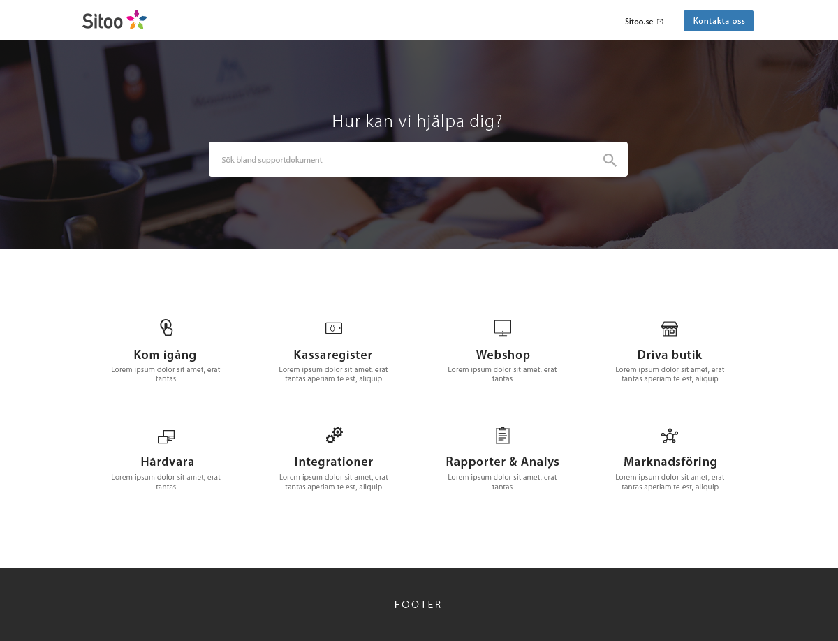
Information architecture
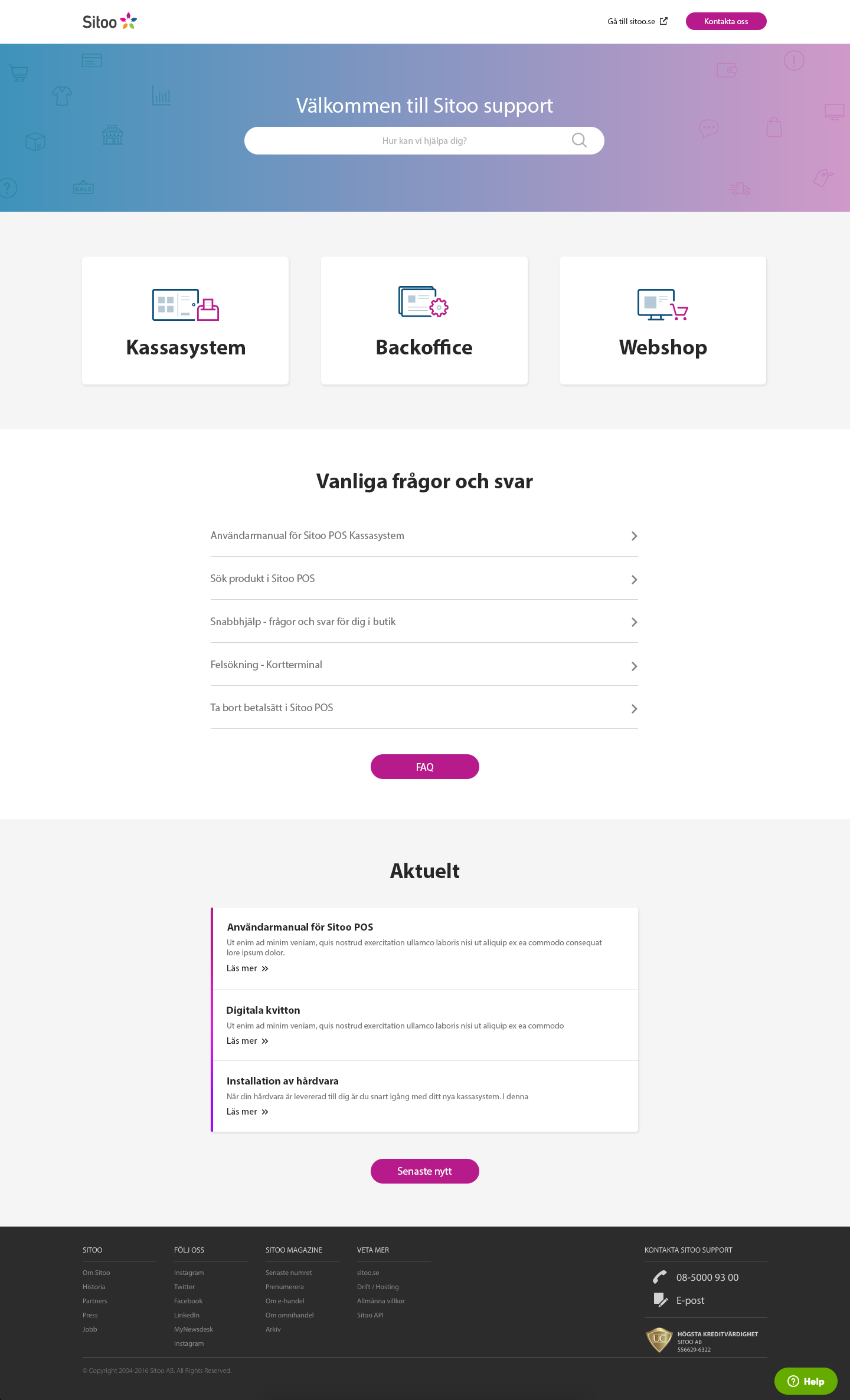
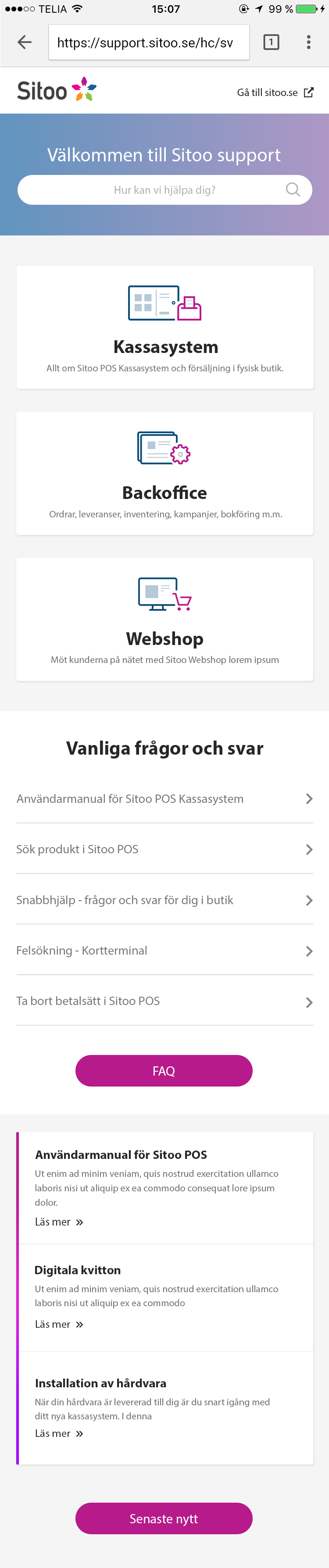
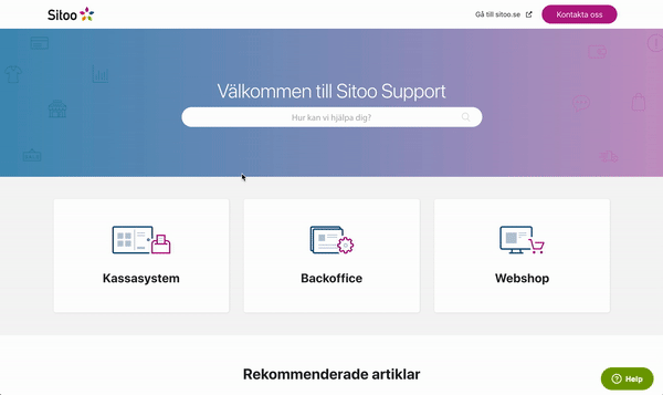
Since the company has three products, we decided to highlight them in the starting page. In this case, customers will immediately know in which category to find the needed solution.
By looking at the analytics, we saw who is the most important and searched product and from that result we made an order like this:
By looking at the analytics, we saw who is the most important and searched product and from that result we made an order like this:
1. Cash register
2. Back office and
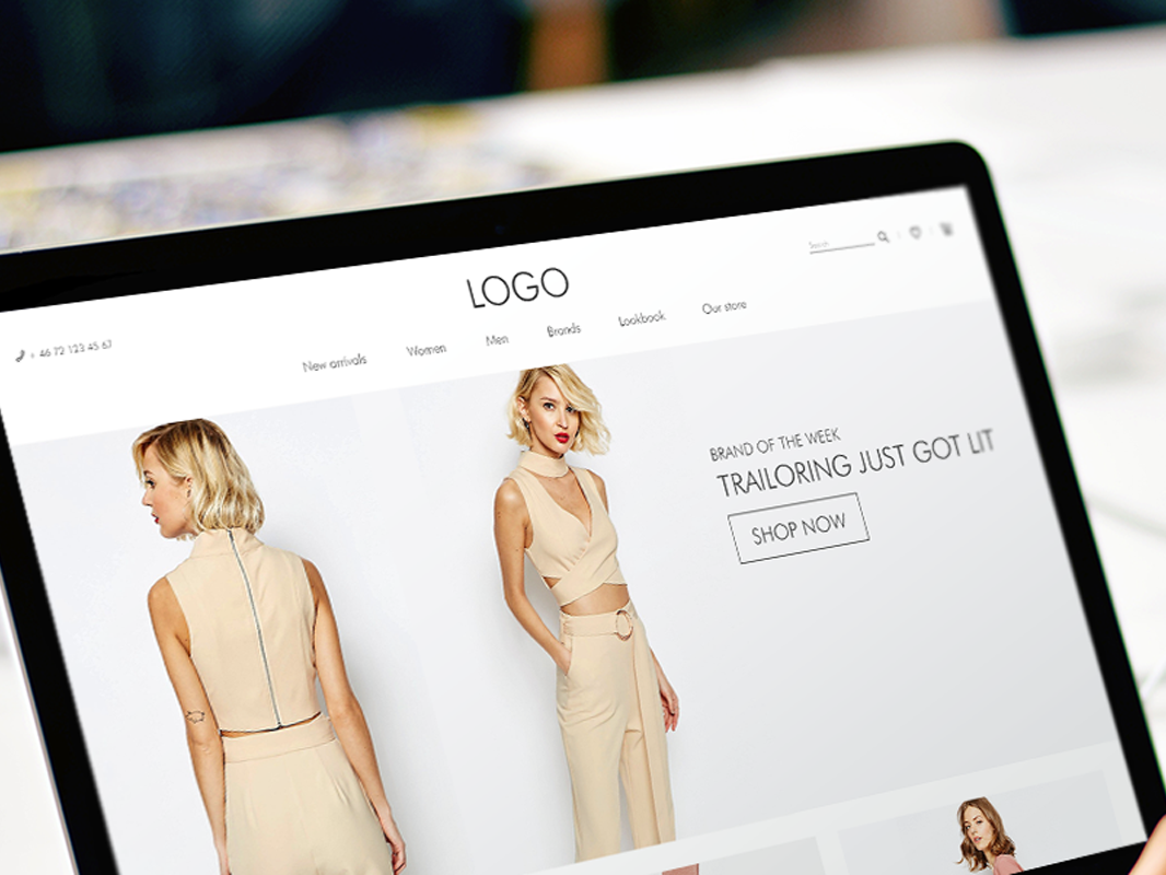
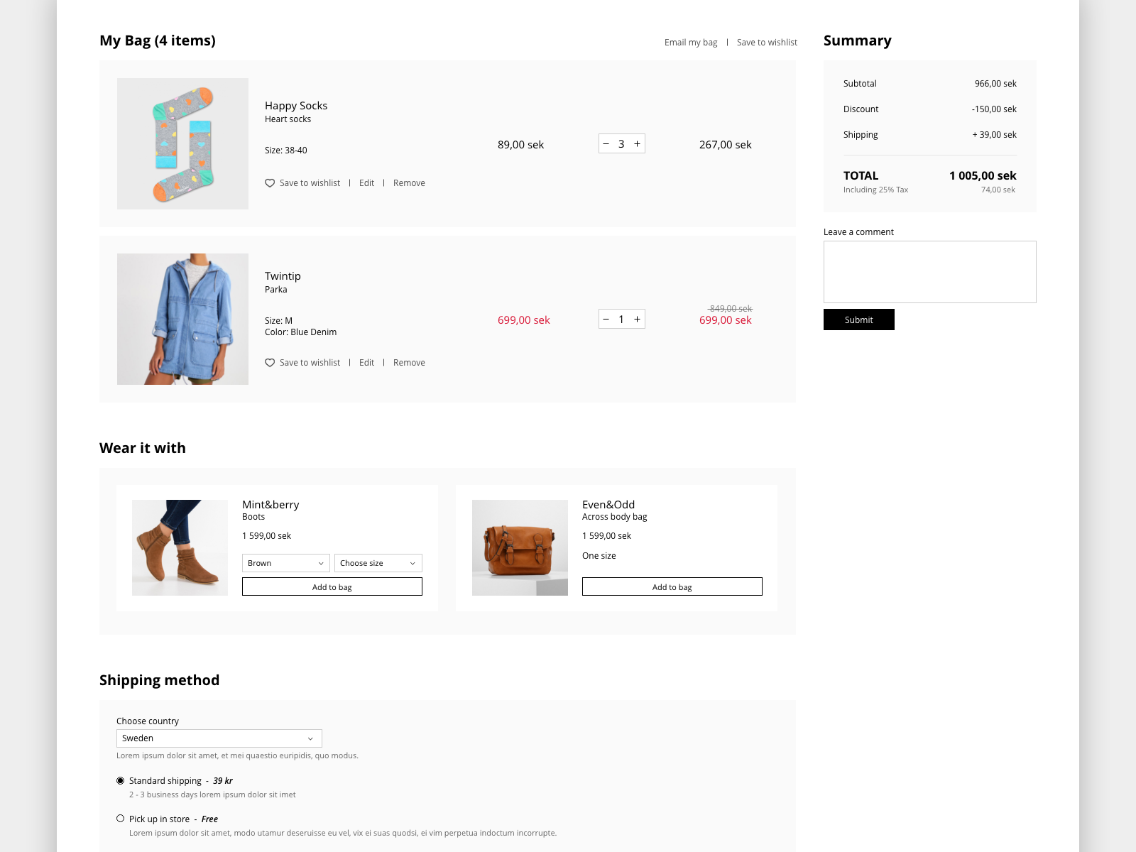
3. E-commerce
Section with frequently asked questions is placed right underneath the categories with most asked questions in the latest 3 months.
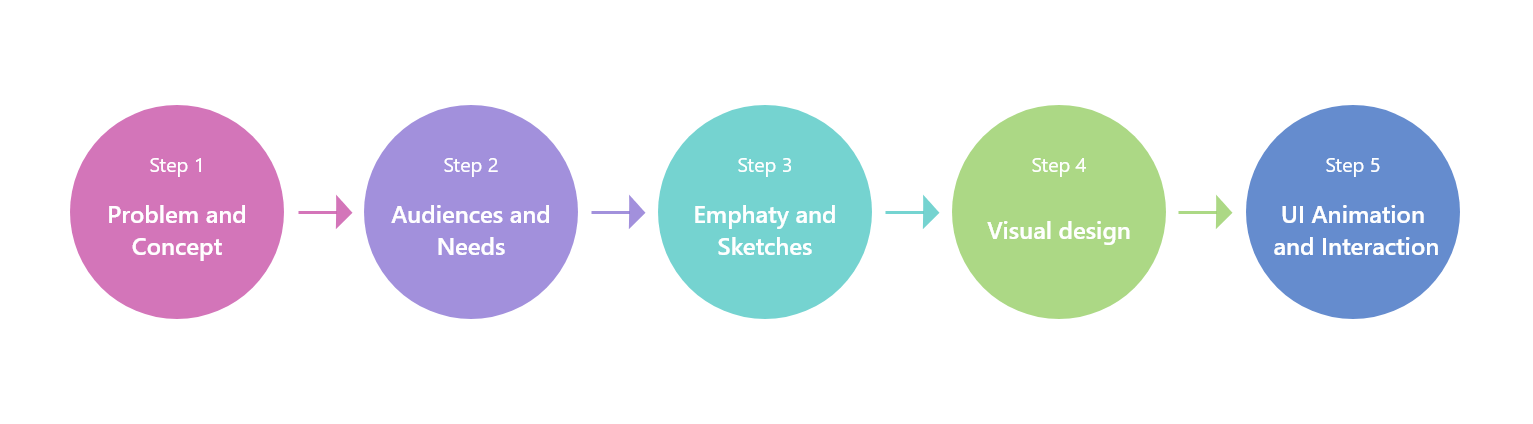
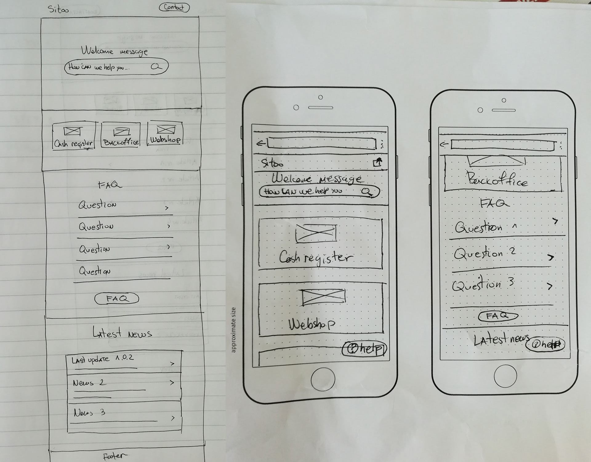
Design process & sketches
I did some initial sketching on paper with pencil and sharpies.
Visual design
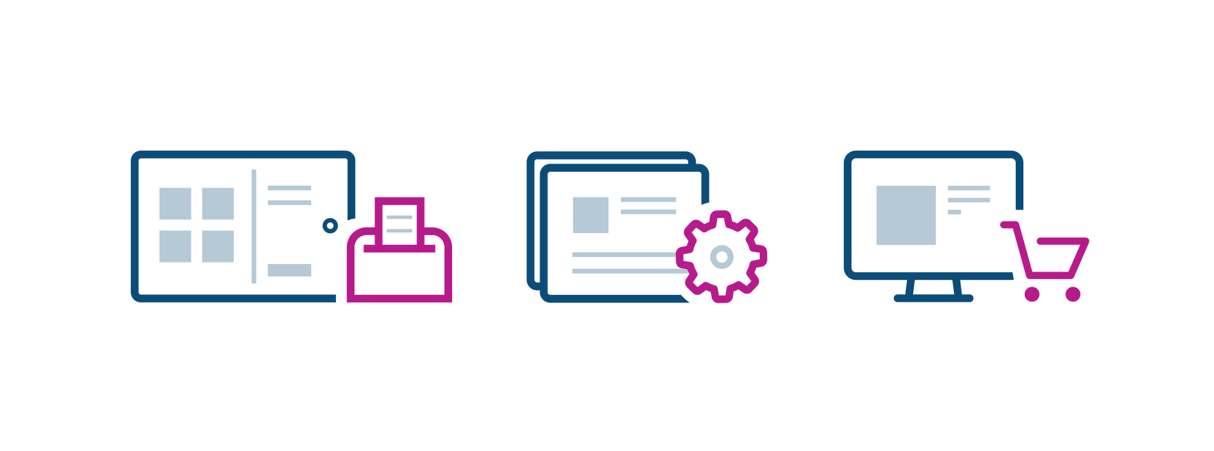
Icons
All three icons have something in common. The light blue squares are actually product images, which are main symbols for this company.
Our brain process visual information 60,000 times faster than text. So, a customer would see the icon and will know in which to category to find the needed answer, without reading the headline.
Final design
Team
UX Designer, Support team, Frontend developer